top of page

Background
The current implementation has led to significant user confusion and high operational costs. This initiative aims to overhaul the card's entire user journey from onboarding and funding to daily usage and management by focusing on clarity, simplicity, and user empowerment.
Goal
-
Reduce Operational Overhead: Reduce the time spent by Ops on user education for card features, measured by internal surveys.
-
Drive Card Adoption & Usage: Increase the monthly transaction volume per active card user by 15%.
Challenges
-
Guiding Users Through Change: Crafting a seamless transition path for existing users to adopt the new interface, mitigating the learning curve and potential resistance.
-
Balancing Security and Accessibility: Designing a flow to view sensitive card details (CVV, card number) that is both highly secure and user-friendly for online purchases.
Start with competitor analysis
This is not just about looking at screenshots. I will systematically break down how best-in-class competitors solve similar problems. (e.g., Revolut, Wise)

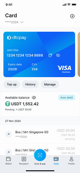
Design solutions
Here are the key enhancements made to the card management screen, focusing on security and usability

Apply filters
-
Dual-Entry System: Implemented both quick-access chips for common filters and an "Advanced Filter" modal for more complex queries.
-
Intuitive Date & Type Selection: Designed clear bottom sheets for selecting custom date ranges and multiple transaction types without leaving the main screen.

Transaction details
The transaction details page has many scenarios, organized under the design system specifications for easier discussion.

Interaction, edge case & error handling
Before handing it over to development, I usually organize various interaction methods and error scenarios, and mirror it on my phone for easier communication with PMs.

Handover indexing
Before handing it over to development, I usually organize various interaction methods and error scenarios, and mirror it on my phone for easier communication with PMs.

Result
We achieved a 35% reduction in support tickets related to common card inquiries. The new, intuitive "Freeze" button and the "Show details" interaction empowered users to self-serve, directly reducing the support queue. We surpassed our target, achieving an 18% increase in monthly transaction volume per active user.

Project Learnings
This project was a powerful reminder that thoughtful security design is not a barrier but a gateway to user trust. By prioritizing intuitive controls like the "Freeze" function, we empowered users to feel more secure, which directly translated into higher engagement and achieved key business goals. The biggest takeaway is that a user who feels in control is a more active and confident user.
What's next?
Next, I will conduct testing, gather user feedback, and continuously optimize the product to ensure its functionality and user experience are further improved.
More works


bottom of page